
Assignment Walkthrough #2 - ECLIPSE MAGAZINE COVER FOR CLICK
After working 18 years for the Carus/Cricket Media Group, I finally received my first cover gig! Yay! It’s for the July/August 2017 cover for CLICK magazine.
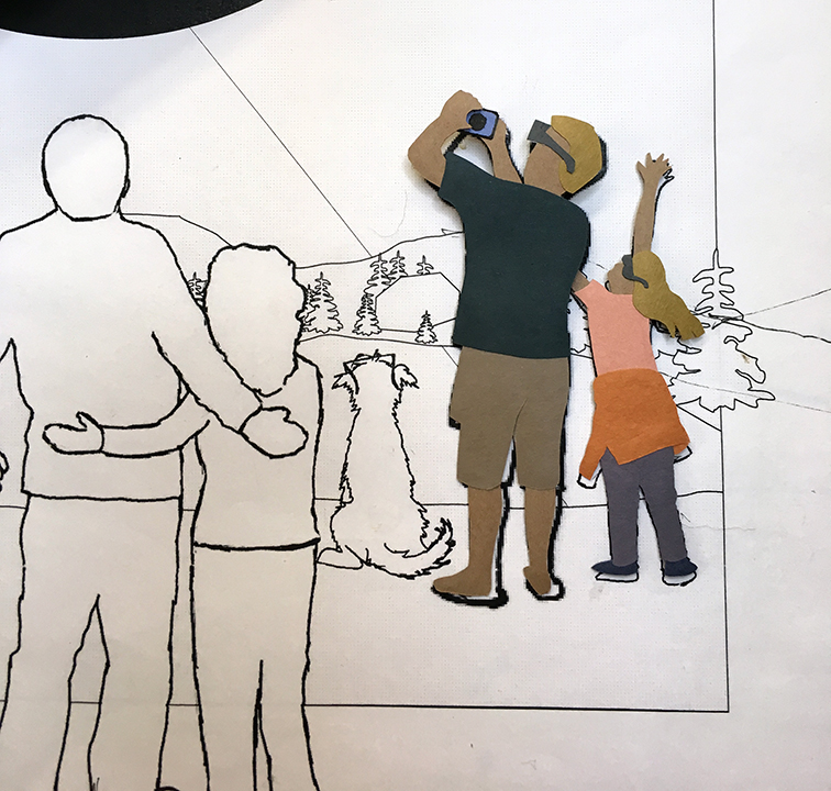
Here’s a little walk-through of how I created it. I usually start by bringing the layout provided into Photoshop. They wanted a variety of people and families viewing the eclipse – safely, of course – some close-up, some a little further away. I sketch my different elements separately and arrange them on the layout in Photoshop. When I think it’s good, I email the sketch to the client. Sometimes they want lots of changes, sometimes only a few. Then I print out my sketch to my working size, usually 125%.

By the way, I always leave a generous bleed around my images, typically one inch all around. It gives the client more flexibility on how they use the image. In this case I couldn’t stand cutting people off at the ankles so I went a little further and added feet.
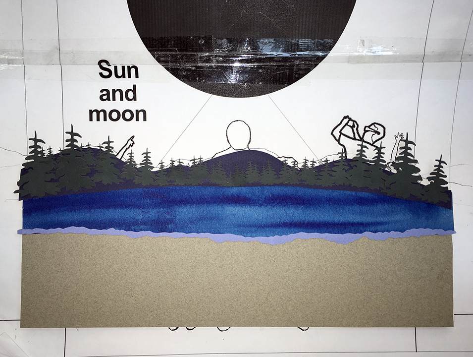
From there I start working on the individual components, including the background.
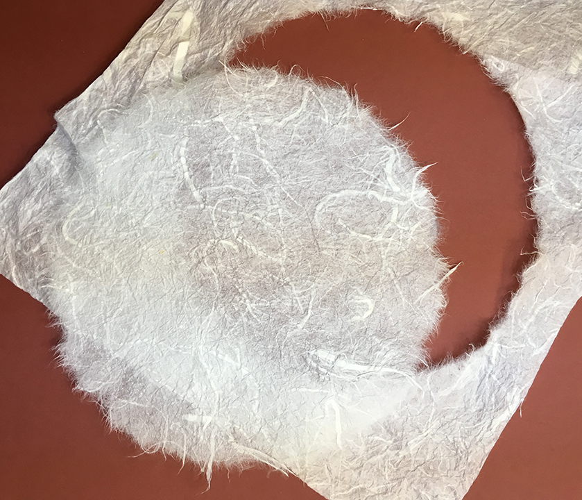
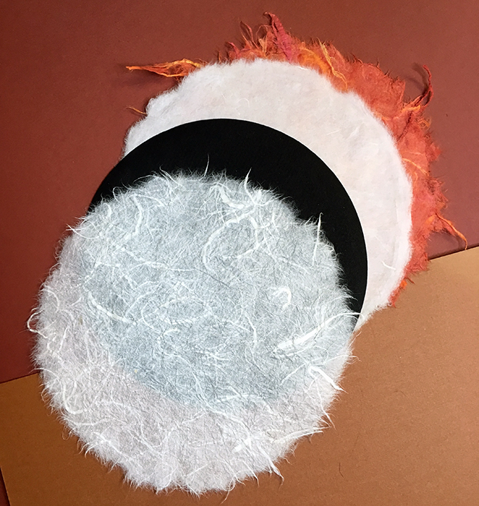
Every assignment presents its own challenge. For this one, the client wanted to be sure I caught the characteristics of the eclipse’s corona and sun flares, particularly the fuzzy and random aspect of them. While I could have cut those shapes out, they would have had a hard edge. I talked to my art director about how best to do that. I briefly thought about inserting little LED lights behind the black shape – I had done something similar before – but quickly put that idea on the back burner as it would require the expertise of my husband, who I already burden with too many other requests. No, I had to rely on myself and my burgeoning stash of paper.
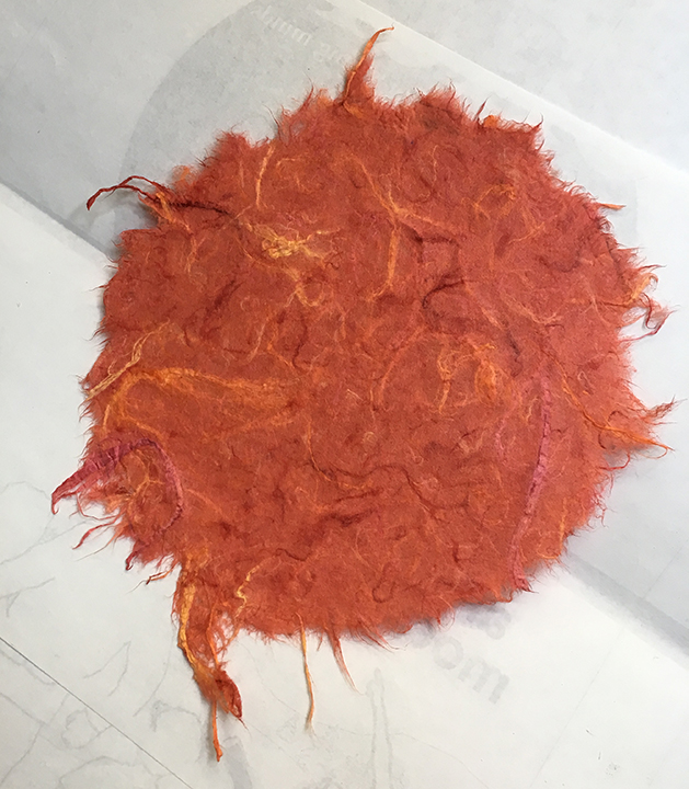
Crafters, particularly quilters, will understand the theory of saving something because ‘you might find a use for it someday’. Way deep in a little used drawer of exotic papers I found my answer. Not only did I find a couple sheets of white rice paper but also a wonderful red orange paper with thick fibers.
I started by tracing the correct size circle on the backside. Then I went over the line with a brush and water, continuing the process until the water soaked through. Then I pulled and teased the excess paper away from the circle leaving a beautiful fuzzy edge. The thick red paper was harder to rip away but that was good. The thick fibers left would be perfect for the sun flares.
With the last of my elements completely, I glued it together and brought it to the photographer.
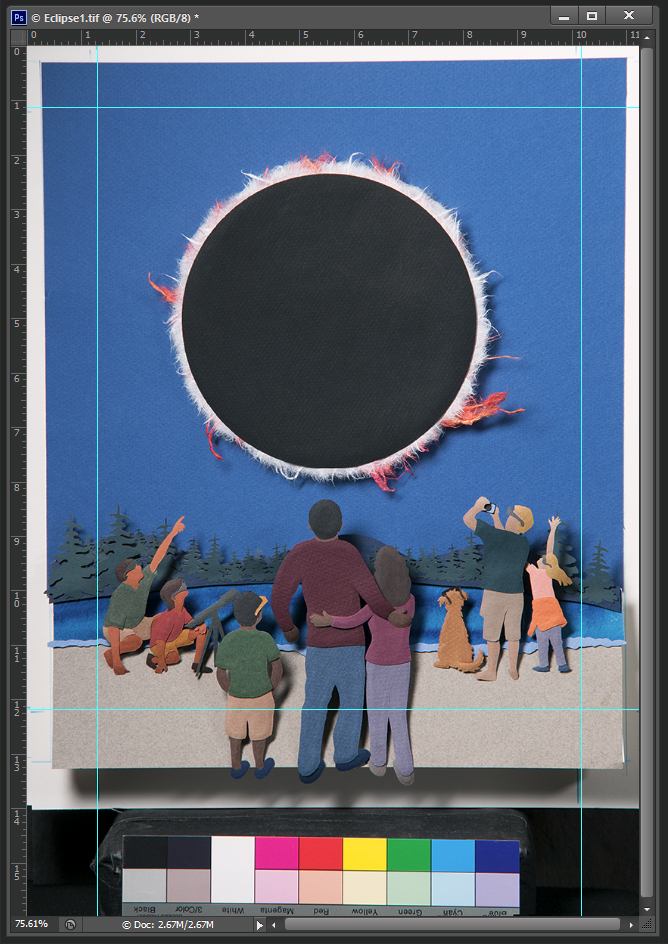
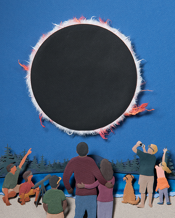

The first photo is how it was photographed with the color bars for color correcting. Notice the blue lines I added in Photoshop. This is how it was supposed to be cropped according to the sketch I had submitted. The second photo is the cropped image. If you look at the final cover though, they panned out and used some of my bleed. It gave them more room to add their little characters that run throughout the whole magazine. I like how they added the drop shadow to make them look like they belonged.


